
Coder VS Graphic Designer - How to properly prepare documents and deliver a quality result
Introduction
This article is about two worlds - the world of web design and the world of coding. It is meant to describe the issues that happen in practice. At the same time, it will also show some best-practices that I think are good to know, using concrete examples.
Graphic designer's view
The incentive of a graphic designer is to deliver a good graphical result. A design that will have a wow effect, that will be modern and maybe even novel. Something that puts a piece of themselves into it, dazzles the client and fits the brief at the same time. A good graphic designer follows trends, tries to combine new elements and push themselves in creativity.
However, in my experience, a graphic designer often doesn't want to get bogged down in technicalities. He doesn't start learning the differences between background-size:cover; vs background-size:contain; or studying the grid of, for example, Bootstrap.
Coder's view
While from the coder's side, it's often about converting design into a consistent form that has order and rules if possible. Defining a reasonable number of colors and fonts. Splitting the page into reusable components or spacing in nice numbers - who wants to have padding-left: 17px; ? or even worse padding-left: 1.0625rem.
On the other hand, coders often lack understanding of the graphic designer's intent. Yes the ratio of logo size to font size in menus is important to keep, as is symmetrical indentation of products in category listings and so on...
What about it?
Exactly the same as in any human-to-human relationship, i.e. communicate.
Graphic designers don't be afraid to ask coders what's important to them, let yourself be drawn into their world a bit and take away what will be pivotal to delivering maximum final quality. Ask what you can do to make the coded result more like the design, if they use any CSS frameworks and what their patterns are, what JS libraries they prefer to work with, and if they have any specifics that would be good to know about before designing something that will subsequently be a terrible bottle-neck.
Coders don't be afraid to go back to the graphic designer with the delivered design and tell him what you're struggling with, or what you need to dodge in the design, so that the result is the best possible and maybe also that the time spent is efficient. If you don't have a responsive design delivered then at least ask for a key part in the responsive design, it won't cost the graphic designer so much time and you won't worry about figuring it out on mobile.
In the following sections, I will discuss specific examples that I would recommend from a coder's perspective for a design development workflow.
Colour definition
Every modern web design software can define key colors that can be used in a project. For the coder it is a great help if the graphic designer defines and ideally describes them (in the style of primary-100, primary-200, primary-300). He then uses only the colors he has defined, this allows the coder to create identically named variables and when coding he doesn't even worry about the hex number of the color, he just looks at the name and uses the identically named variable.
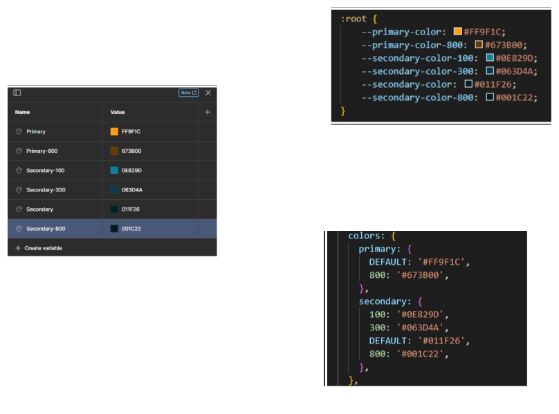
Additionally, variables named this way (ideally mirrored design <-> code) make it very easy to re-brand the page. That is, by changing one variable, you can overwrite the color of the entire site.
Spacing, padding, margin
Another minor difficulty is the values chosen for indentation, either internal padding or external margin. The problem occurs when the graphic designer chooses values by eye and doesn't have insight into the coder's techstack. Whether we're talking about bootstrap grid values or perhaps tailwind values, no coder is going to be too happy specifying "magic numbers " like padding: 11px 23px; but instead choose the near eye-pleasing values of padding: 12px 25px; or if we're talking about Tailwind, the utility classes py-3 px-6.
Neither option is a happy ending, the ideal would be to sit down with a graphic designer and see how spacing works together in what you like to do. After all, even the graphic designer will be happier if it fits better.
Components
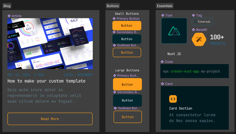
A great thing in modern web design is the ability to wrap a part of the GUI, or one particular element, into a component and then reuse it. The satisfying part is that this is exactly what we can do in development, we can wrap a component and reuse it with different inputs and therefore content.
This means a lot, for example you can define component states in the design and design how the active input field will look like for example. It is possible to reuse a component to create a binding to a so-called master component and by changing the design in the master component to reflect the changes in all places where it is used.
Theoretically, this can help the programmer lay out the distribution into components, because if they know you'll be using a piece of UI in multiple places, they'll create a component right away.
By starting to create the components as a graphic designer, you are subtly forcing yourself to use them on the site, thus saving the programmer development time.
Export icons
Saving vector icons for use on the web is a discipline in itself for me. It depends a lot on how you work with icons on the web, and the requirements for saving them properly depend on that. However, I will allow myself to pick out a few general pointers.
Size, ratio
Icons that are to be next to/above each other or are required to be aligned in some way, it is very important to export them with exactly the same canvas/artboard (drawing area). Personally, I recommend putting X identical artboards side by side and placing the icons one at a time so that they visually match and at the same time the icons don't have too much empty space around them. This will give us the best chance of having them display great on the site.
![]()
Style
If we want the icons to look the same style we need to give them the same stroke thickness, again it's a good idea to line them up in artboards and check them all at once.
Icons with stroke
We always export icons (unless otherwise required) by converting stroke to shape, called the outline stroke function. This way the icon loses the ability to change the stroke thickness, which is what we want on the site, because it will behave consistently when zoomed in/out.
Icons in font
If icons need to be exported with the intention of generating a font from them, then it is important to pay attention to other criteria. If we consider generating a font from Fontella, for example, then we need to have the icon unified into one shape (union).
Furthermore, we need to have the icon only in one color, without any background, because once the icon is converted to a font, it will be completely colored to the text color (CSS color value).
If you are generating a font using Figma, make sure that the resulting SVG does not contain the fill-rule:evenodd; or clip-rule:evenodd; attributes, because Fontello can't handle those. If you'd like to know more about the combination of fontello and figma, then I recommend this article.
A few tips for the end
Kits for graphics
Help yourself with the technical stuff by using pre-made templates, for example for Bootstrap grid there is this template. If you want a whole kit of components for Booststrap, then I recommend this template. Then for the tailwind template, this kit is useful, showing the basic principles of the framework.
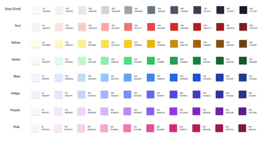
The point I'm trying to make is make your job easier, there are a great many shared libraries/plugins that will make your job easier. Just check with your dev team and pick the right workflow.
Extensions for coders
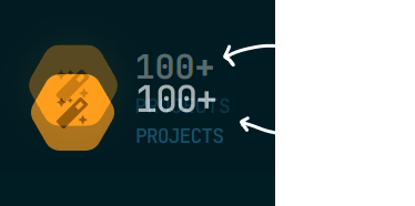
It's been my experience that us coders can sometimes lack an eye for detail and simply may not notice some small difference in design. That's why it's always a good idea to compare the design with the final site and check if everything is displaying correctly. For this purpose, I personally use the browser extension Pixel Perfect, which allows you to overlay the design over the site and see the differences in the result compared to the original design.
Note: I don't think we should create pixel-perfect code because the web is a fluid medium, but I think it's necessary to do at least a cursory check to make sure everything fits as it should.
Conclusion
The creative world of a graphic designer and the exact world of a coder are very different, but both should have the same goal - deliver great final quality. The only way to achieve this is by fine-tuning our workflows together and educating and learning about each other's worlds.
Did you miss any information in the article? Do you have any questions? Feel free to contact me :)
Useful links
Get in touch - the first 30 minutes of consultation are free.
Newsletter
Stay in the loop
Get notified about new articles and tips. No spam.
You might also like
Sharing knowledge is a loving expression of care for the community. Let's learn something new together.

7 most common web developer mistakes, don't you make them too?
Let's take a look at what beginners struggle with most often and what could help them move forward. I've focused on 7 issues that I see as essential in my practice.
Read more
Introduction to the framework, should I implement it in my Tech Stack?
Find out how Tailwind CSS makes web development easier. Utility-first framework with predefined classes for faster development.
Read more
Guide to the World of Web Image Formats
Learn the differences between the different formats and their advantages and disadvantages. We will show examples of how to use them and when to use which format.
Read more